Making my website 10x smaller in 2024, with a dark mode
It’s been almost 8 years since I started this blog, and 3 years since my last behinds-the-scenes post when I had to reinstall my website due to a datacenter fire, so it’s high time for another update. In recent years, I decided to finally add a dark mode, which browsers have now supported for 5 years. However, this was easier said than done, as I first needed to inventory all the colors defined by layers of CSS frameworks, blog templates and my own additions. I ended up going down the rabbit hole and optimizing many other aspects of my website.
This post is greatly inspired by Dan Luu’s Speeding up this site by 50x (November 2014) and The modern web on a slow connection (February 2017). With a major difference: I only trimmed the useless parts, preserving this blog’s identity by keeping the style intact (and extending it with a dark mode of course).
Dan Luu’s posts still resonate well with me: the modern web is quite bloated, yet I regularly find myself browsing from remote areas, such as on a train in the middle of the countryside. Yes, in the era of bloated Electron apps there is room for making even a static website small and fast again, and chances are that this post will teach you a few things to apply to your own website.
What’s the best way to serve Google Fonts in 2024? Is it fine to serve WebP images with a quality of 50? Read on to learn more!
- Profiling tools
- Server optimizations
- Fine-tuning web frameworks
- Fonts
- Images
- Dark mode
- Cache policy
- Results
- Bonus: a little CSS mystery
Profiling tools
Any optimization effort starts by measuring, in order to focus on effective improvements. The web is no exception, and thankfully there are several free services that analyze your website and propose recommendations. I’ve used:
- webpagetest.org, which gives a detailed timeline of all resources downloads and provides customized simulations (location, device type, browser, network connection speed, etc.),
- Google’s PageSpeed Insights, which is more minimalist but gives an overview score and recommendations upfront.
- Google’s web.dev docs also helped digging deeper.
As a baseline, I considered 3 scenarios: my home page, my last blog post and an earlier post with heavy images, on a variety of locations and network connections. I purposefully chose worst-case scenarios: low-end mobile devices, slow connections, serving to other continents (my server is in Europe). So chances are that my website appears faster to you!
| Page | Location | Connection | Downloaded size | First Contentful Paint | Largest Contentful Paint |
|---|---|---|---|---|---|
| Home | Virginia, USA | 4G | 527 KB | 2.2s | 2.3s |
| Last post | Mumbai, India | 3G | 763 KB | 5.9s | 5.9s |
| Heavy images | Sydney, Australia | 3G | 1,121 KB | 7.2s | 7.2s |
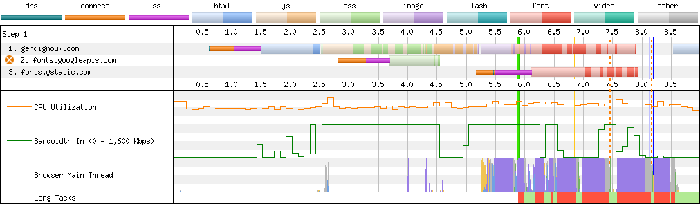
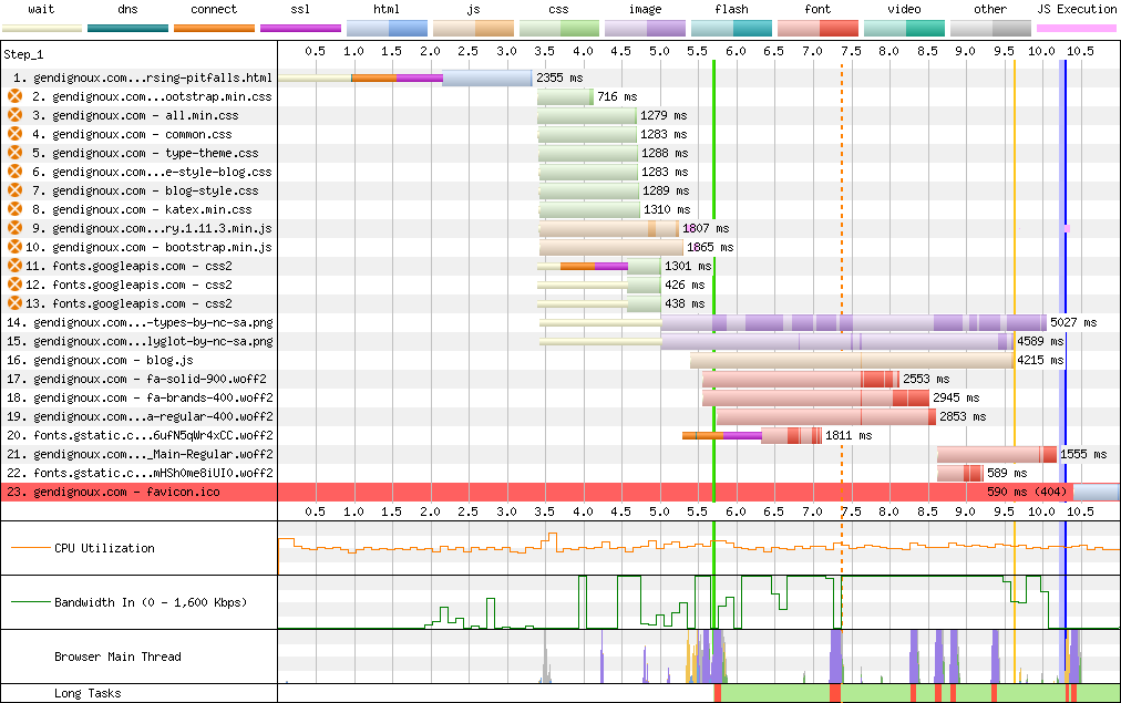
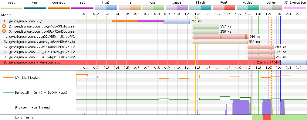
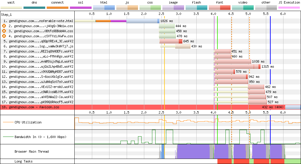
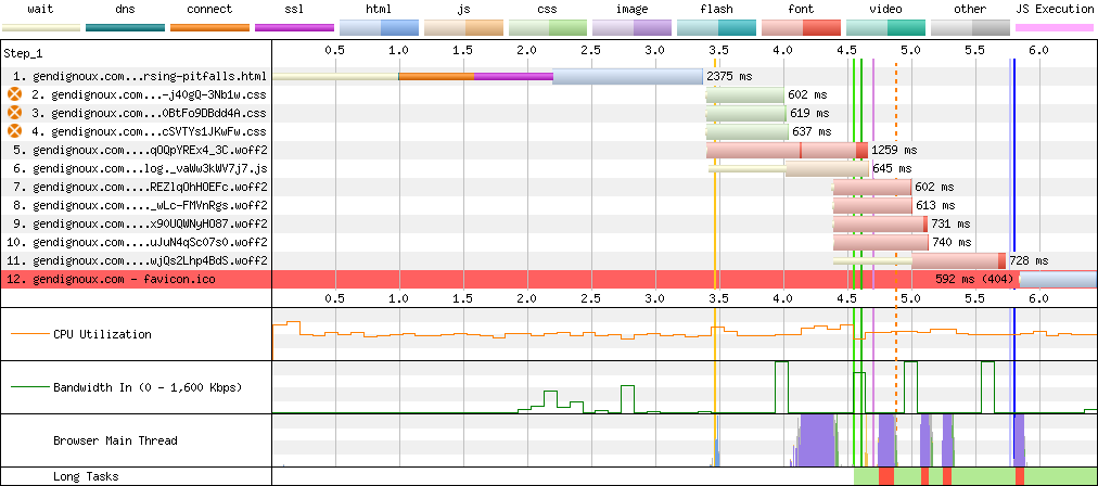
The initial results are clear: each page required downloading between half and one megabyte, took several seconds to render, and the waterfall of resources downloaded by the browser stretched diagonally to the bottom-right. That’s not great for a relatively simple static website.
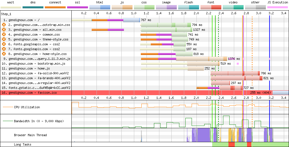 Baseline downloads on my home page.
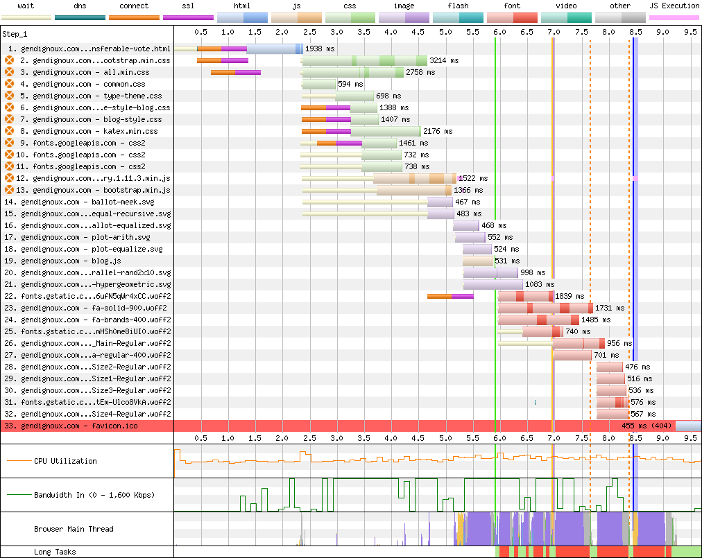 Baseline downloads on my last blog post.
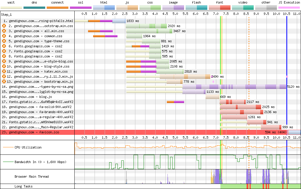 Baseline downloads on an image-heavy blog post.
Server optimizations
My server is a simple Nginx + Debian setup serving pages statically-generated with Jekyll. I hadn’t looked at the configuration much in the last 8 years (other than upgrading it when my previous server was caught in a fire), so there were low-hanging fruits in upgrading to the latest protocols and tweaking the configuration. A lot of users may have slow connections, yet their (hopefully) up-to-date browsers can support recent protocols.
Modern network protocols
The first protocol I enabled was HTTP/2, which has been around since 2015 (RFC 7540). I even wrote a post about parsing HTTP/2 packets back in 2017. A bit ironic that I didn’t have it enabled on my website until now :)
The main difference between HTTP/1 and HTTP/2 is that the former only allows to fetch one resource at a time, while HTTP/2 allows multiplexing requests on a single TCP/TLS connection. This should improve network usage, notably as you don’t need to establish more TLS handshakes for requesting more resources (JavaScript, CSS, images).
The effect is clear in the webpagetest.org connection view: with HTTP/1 the browser only established 3 connections to my domain at the beginning, and later wasted another second creating 3 additional connections to download more resources.
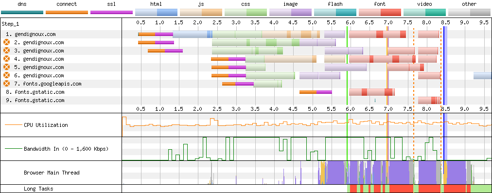 Baseline connections on my last blog post using HTTP/1.
On the latest Nginx, you should be able to simply configure HTTP/2 with http2 on, but the current package on Debian stable is lagging behind (and Debian testing is also off by one).
Instead I had to insert the http2 keyword in listen directives:
listen 443 ssl http2 default_server;
listen [::]:443 ssl http2 default_server;
The outcome is clear: only one connection is created per domain. There can also be a slight latency boost.
 Connections on my last blog post with HTTP/2.
What about HTTP/3 and QUIC? Let’s not get ahead of ourselves, Nginx only added experimental support for that in version 1.25, and as I just mentioned the newest Debian packages are still at version 1.24. But this is on my roadmap for future improvements.
In parallel, it was high time to upgrade Debian (and therefore the Nginx package), as my last update to Debian 10 was out of support. This was relatively straightforward thanks to all the scripts I had set up last time, and unlocked supporting TLS 1.3 as well.
Compression… compression everywhere
An important optimization, prompted by Google’s PageSpeed Insights was to enable Gzip compression for all relevant assets.
Indeed, even though I had gzip on in my Nginx configuration, by default only HTML pages are compressed, which excludes other easily-compressible formats like CSS and JavaScript!
Configuring gzip_types made resources from frameworks like jQuery, Bootstrap and Fontawesome download faster (more on frameworks later).
It also helped with SVG diagrams.
In practice, the initial rendering latency (green vertical line on webpagetest) decreased by 2 seconds with compression, because the CSS and JavaScript resources that block rendering arrived faster.
 Downloads on an image-heavy blog post with HTTP/2 and compression enabled.
The default Nginx configuration proposes a commented-out set of MIME types, but this list notably excludes relevant types like SVG, so I chose to configure the wildcard type instead with gzip_types *.
Indeed, the browser always filters compression algorithms it wants via the Accept-Encoding header, so there is no point restricting types on the server side.
Another problem is that Nginx uses the lowest Gzip compression level by default, which is the fastest but not the smallest.
We can configure a higher level (up to 9) with gzip_comp_level.
To compress even better than level 9, we can use the Zopfli algorithm.
To give a representative example, the HTML file of my previous post (282 KiB) compressed to 13.4% of its size with Gzip level 1 (37.7 KiB), 9.7% with level 9 (27.4 KiB) and 9.4% with Zopfli (26.4 KiB).
The good news is that Zopfli is entirely compatible with Gzip decompression (it only searches the compression space harder). The bad news is that it’s slow, so we don’t want to run it on the critical serving path of every request. And Nginx doesn’t support it as a configuration.
What Nginx supports is the gzip_static mode: instead of reading foo.html from the filesystem and compressing it on the fly, Nginx will look for an already-compressed file foo.html.gz and serve that directly (or fallback to on-the-fly compression if the .gz file doesn’t exist).
This is perfect for applying Zopfli to all the files ahead of time.
To use
gzip_static, you need to make sure that Nginx was compiled withhttp_gzip_static_module, which you can confirm withnginx -V 2>&1 | grep http_gzip_static_module.
With that, you may be wondering: why not support the Brotli algorithm, developed by Google and standardized in 2016 (RFC 7932)?
It turns out that Brotli is only built into the “Nginx Plus” paid plan.
The underlying ngx_brotli module is open-source though, but using this open-source variant requires compiling it manually, which increases my burden to maintain the website.
Also, the module’s maintenance status is unclear (issues, pull requests) – and as far as I can tell all the Nginx paid plan does is compiling it for you.
Brotli would have compressed my example page down to 20.8 KiB (21% smaller than Zopfli), but I’ll leave it out for now.
According to Harry Roberts, the difference between Gzip and Brotli might not be that large in practice anyway.
Fine-tuning web frameworks
My website relied on several well-known frameworks, to make styling or rendering of math more effective. But frameworks have a maintenance cost and make the website more bloated, so it was time to refresh them.
KaTeX
One thing I recently noticed was that the fonts were slightly off in mathematical formulas rendered by KaTeX. As I explained 4 years ago my setup is mostly static: a Kramdown plugin expands math formulas into HTML, so my website only needs CSS and fonts at rendering time (manually downloaded from one of the GitHub releases). This seems pretty stable right? As long as it works, no need to update KaTeX’s CSS and fonts?
The problem was that the HTML generation got updated in the meantime, as I rebuild the Docker container in which I run Jekyll from time to time. This meant that there was a mismatch between the newer KaTeX that generates the HTML and the CSS/fonts from the older KaTeX that I serve on my website. In particular, the CSS class that wraps mathematical objects was renamed, and the new class didn’t exist in my old CSS resources, so the formulas were displayed with the wrong font. The difference was not obvious because the fallback was still one of the KaTeX fonts. Looking at my git history, this rendering bug dated back to October 2021. In the end, I fixed it by upgrading to KaTeX 0.16.9, which incidentally came with smaller font files :)
Getting rid of Bootstrap
Bootstrap was probably the framework that made “responsive web” a widespread reality, a long time ago. So it’s no surprise that the blog template I picked depended on it. The problem is that it’s a behemoth of CSS and JavaScript – at least for what I used of it – and that many things in my template implicitly depended on some CSS rule or JavaScript function from Bootstrap.
Remember: my initial goal was to configure a dark mode, which first meant collecting all colors defined in CSS. And Bootstrap defines a lot of colors.
At this point, ditching it altogether seemed like the right call, as I wouldn’t have to find replacements for unused colors, and the website would become more lightweight. Disentangling all the implicit dependencies was definitely a tedious back-and-forth between the source code and the browser’s developer options. But it was a technical debt worth paying for, and I learned some things about CSS along the way.
jQuery or not jQuery?
My website didn’t have much JavaScript: handling show/hide actions for the navigation bar and spoiler sections, and prepending anchor links to each section header (until I figure out how to generate them directly in Jekyll). Note that these are entirely cosmetic, my website should work fine with JavaScript disabled (with spoilers expanded by default). I also made a WebGL animation once.
For these, I used jQuery out of habit – the syntax is shiny and it should work with older browsers. It was also a dependency of Bootstrap. That said, jQuery amounts for quite a bit of code that I didn’t use. Enabling compression helped decrease network usage, but all this JavaScript still needs to be interpreted by the browser. My first step was to upgrade to the “slim” build, which excludes Ajax code that I don’t use.
But how about getting rid of jQuery altogether? That way, no future maintenance, fewer bytes on the network and fewer useless code for the browser to interpret. Modern browsers support standardized APIs to manipulate the DOM, and following the guide from youmightnotneedjquery.com made it straightforward. In 2024, it was high time to drop support for Internet Explorer. The last version of IE might even be supported after all.
Fonts
Custom fonts are great to give a unique identity to one’s website (unless you’re Dan Luu – in a way no style is a style). The problem is that fonts add resources on the critical path: text won’t render properly until fonts are loaded. Additionally, fonts are usually a large contributor to bandwidth (after media). For example HTML files on my blog typically compress around 10 KB, while fonts could add up to hundreds of KB before optimizations.
Fontawesome
On my website, the main contributor to font bytes was Fontawesome icons. This framework leverages CSS and custom fonts to conveniently provide icons for non-designers like me. Even though Fontawesome shards icons in a few categories (regular, brands, etc.), each font file contains hundreds if not thousands of icons and storing all of these takes space even with the most compressed font format WOFF2.
In my case (Fontawesome version 5.13.1), fonts added up to 171 KB and unfortunately WOFF2 cannot be compressed further in transit as it already uses Brotli under the hood. Additionally, Fontawesome’s (minified) CSS weighs a non-negligible 59 KB, reduced to 11 KB with Zopfli.
A great way to significantly reduce this size was to subset the fonts, by removing all the unused glyphs (i.e. icons). Indeed, I only use a few dozen icons, which is a few percent of Fontawesome. There are several available subsetting tools, that take as input the original font file and list of characters to include in the result. My recommendation is fonttools, written in Python and available as a Debian package.
I originally hadn’t found a convenient command-line tool to do it (although the
allsortsRust crate looked promising) and mentioned the transfonter.org website. However, a local command-line tool gives you full control over the subsetting process.
More specifically, the Fontawesome CSS contains rules like follows, where each icon corresponds to a Unicode codepoint.
/* Icon represented by Unicode character 0xF781. */
.fa-blog:before {
  content: "\f781"
}
My first step was creating a reduced CSS file, containing only the rules for my icons.
Collecting the list of all icons used in my website was a bit tedious but doable via grep .fa-.
Then, a bit of Bash scripting extracted the list of Unicode codepoints in suitable format for subsetting.
$ cat css/fa.css | grep content | cut -d'\' -f2 | cut -d'"' -f1 | paste -sd "," -
f042,f043,f047,f052
$ fonttools subset \
    font.woff2 \
    --output-file=subset.woff2 \
    --unicodes=f042,f043,f047,f052 \
    --flavor=woff2 \
    --verbose
The size impact is quite significant: my reduced font files now take fewer bytes than the original compressed CSS!
| Type | Fonts (WOFF2) | CSS | CSS (gzip) |
|---|---|---|---|
| Before | 171 KB | 59 KB | 11 KB |
| After | 5.4 KB (-97%) | 2.6 KB (-96%) | 870 B (-92%) |
Google Fonts
Google Fonts offer a great collection of open-source fonts, free to use in one’s website.
In principle, using them is straightforward: just add a link to a CSS file, set the font-family CSS property, and you’re done.
Behind the scenes, this CSS contains reference(s) to font file(s), using @font-face rules.
/* cyrillic-ext */
@font-face {
  font-family: 'Roboto Slab';
  font-style: normal;
  font-weight: 300;
  src: url(https://fonts.gstatic.com/s/robotoslab/v34/BngMUXZYTXPIvIBgJJSb6ufA5qW54A.woff2) format('woff2');
  unicode-range: U+0460-052F, U+1C80-1C88, U+20B4, U+2DE0-2DFF, U+A640-A69F, U+FE2E-FE2F;
}
...
While convenient, this approach is not very optimized.
Indeed, to obtain the font and render text properly, the browser has to resolve a chain of dependencies (HTML > CSS > font file).
To compound this, each of these 3 resources is served on a different domain (your website, fonts.googleapis.com and fonts.gstatic.com).
For each domain, your browser needs to perform a DNS resolution + a TLS handshake + getting a TCP connection up to speed (see also RFC 5681).
On bad network conditions, these add up to seconds of latency, during which the website will either display nothing or flicker later when switching to the correct font.
This is clearly visible on the webpagetest connection view.
 Connections on my home page with Google Fonts.
So it’s no surprise that many Internet guides explain how to optimize Google Fonts.
The official docs give two pieces of advice.
Firstly, enabling the font-display: swap CSS property allows to use a fallback font until the real font is loaded.
With Google Fonts, this is done by appending &display=swap to the URL.
While this doesn’t really address the latency, better display text with the wrong font than no text at all.
That said, this also causes layout shifts when the real font arrives later.
Another issue is that initial rendering is anyway blocked until the CSS is downloaded from fonts.googleapis.com, because the font-display: swap directive is contained in that CSS.
The other official advice is not very actionable: send all the text you want to render, and get back a customized CSS pointing to a subsetted font. This can reduce the download usage, but makes the URL potentially very long and doesn’t even address the latency of connecting to 3 domains.
Fortunately, third-party guides such as Making Google Fonts Faster in 2022 summarize other options.
One option is to tell the browser directly in the HTML file that it should connect to fonts.gstatic.com (the last domain).
This will trigger DNS resolution and a TLS handshake, without having to wait for the CSS to arrive and be parsed.
<link rel="preconnect" href="https://fonts.gstatic.com/" crossorigin>
In principle, you could also use a preload link to directly tell the browser which font file to download.
However, this is a risky bet, because it can become obsolete if a new version of the font is released.
Additionally, Google Fonts serves different CSS and font files depending on which features the browser supports, so this preloaded file may be useless.
<link rel="preload" as="font" type="font/woff2" href="https://fonts.gstatic.com/s/robotoslab/v34/BngMUXZYTXPIvIBgJJSb6ufA5qW54A.woff2" crossorigin>
There is however a more radical approach: directly host the fonts on your website. Indeed, once the HTML is downloaded, we already have an established connection which can be reused to download other resources – thanks to HTTP/2. However, Google Fonts doesn’t offer any ready-to-use package of CSS + fonts. I could manually check what my browser downloads, but some automation would be helpful. Additionally, I noticed that the CSS downloaded by my browser only contained fonts in WOFF2 format, so what about compatibility with other font formats?
At first glance, third-party tools like google-webfonts-helper seemed to offer what I needed, with a JSON API to get URLs to the fonts in various formats (TTF, WOFF, WOFF2). However, the URLs didn’t seem to quite match what my browser was seeing. While trying to reproduce the results in the command-line, I noticed another thing: Google Fonts sends a different CSS based on the user agent, following the features that each browser version supports.
I made a small experiment with Firefox versions, and the served CSS indeed matches the supported version tables on caniuse.com.
/* No user agent: fallback to fonts in TrueType format.
 * wget -q -O - "https://fonts.googleapis.com/css2?family=Roboto+Slab"
 */
@font-face {
  font-family: 'Roboto Slab';
  font-style: normal;
  font-weight: 400;
  src: url(https://fonts.gstatic.com/s/robotoslab/v34/BngbUXZYTXPIvIBgJJSb6s3BzlRRfKOFbvjojISWaA.ttf) format('truetype');
}
/* Firefox 38: WOFF format.
 * wget -q -O - -U "Firefox/38.0" "https://fonts.googleapis.com/css2?family=Roboto+Slab"
 */
@font-face {
  font-family: 'Roboto Slab';
  font-style: normal;
  font-weight: 400;
  src: url(https://fonts.gstatic.com/s/robotoslab/v34/BngbUXZYTXPIvIBgJJSb6s3BzlRRfKOFbvjojISWaw.woff) format('woff');
}
/* Firefox 39: WOFF2 format.
 * wget -q -O - -U "Firefox/39.0" "https://fonts.googleapis.com/css2?family=Roboto+Slab"
 */
@font-face {
  font-family: 'Roboto Slab';
  font-style: normal;
  font-weight: 400;
  src: url(https://fonts.gstatic.com/s/robotoslab/v34/BngbUXZYTXPIvIBgJJSb6s3BzlRRfKOFbvjojISWbQ.woff2) format('woff2');
}
With more recent browsers, two more features appeared behind the scenes:
- the
unicode-rangeproperty to divide the fonts into subsets for various languages, - variable fonts that define variations of the same font (italic, bold, etc.) in a single font file.
Show Hide
/* Font split into several Unicode ranges.
 * wget -q -O - -U "Firefox/44.0" "https://fonts.googleapis.com/css2?family=Roboto+Slab"
 */
/* cyrillic-ext */
@font-face {
  font-family: 'Roboto Slab';
  font-style: normal;
  font-weight: 400;
  src: url(https://fonts.gstatic.com/s/robotoslab/v34/BngbUXZYTXPIvIBgJJSb6s3BzlRRfKOFbvjojISmYmRjRdE.woff2) format('woff2');
  unicode-range: U+0460-052F, U+1C80-1C88, U+20B4, U+2DE0-2DFF, U+A640-A69F, U+FE2E-FE2F;
}
...
/* latin */
@font-face {
  font-family: 'Roboto Slab';
  font-style: normal;
  font-weight: 400;
  src: url(https://fonts.gstatic.com/s/robotoslab/v34/BngbUXZYTXPIvIBgJJSb6s3BzlRRfKOFbvjojISmb2Rj.woff2) format('woff2');
  unicode-range: U+0000-00FF, U+0131, U+0152-0153, U+02BB-02BC, U+02C6, U+02DA, U+02DC, U+0304, U+0308, U+0329, U+2000-206F, U+2074, U+20AC, U+2122, U+2191, U+2193, U+2212, U+2215, U+FEFF, U+FFFD;
}


/* Non-variable font: one font file for each font weight.
 * wget -q -O - -U "Firefox/61.0" "https://fonts.googleapis.com/css2?family=Roboto+Slab:wght@400;500"
 */
...
/* latin */
@font-face {
  font-family: 'Roboto Slab';
  font-style: normal;
  font-weight: 400;
  src: url(https://fonts.gstatic.com/s/robotoslab/v34/BngbUXZYTXPIvIBgJJSb6s3BzlRRfKOFbvjojISmb2Rj.woff2) format('woff2');
  unicode-range: U+0000-00FF, U+0131, U+0152-0153, U+02BB-02BC, U+02C6, U+02DA, U+02DC, U+0304, U+0308, U+0329, U+2000-206F, U+2074, U+20AC, U+2122, U+2191, U+2193, U+2212, U+2215, U+FEFF, U+FFFD;
}
...
/* latin */
@font-face {
  font-family: 'Roboto Slab';
  font-style: normal;
  font-weight: 500;
  src: url(https://fonts.gstatic.com/s/robotoslab/v34/BngbUXZYTXPIvIBgJJSb6s3BzlRRfKOFbvjovoSmb2Rj.woff2) format('woff2');
  unicode-range: U+0000-00FF, U+0131, U+0152-0153, U+02BB-02BC, U+02C6, U+02DA, U+02DC, U+0304, U+0308, U+0329, U+2000-206F, U+2074, U+20AC, U+2122, U+2191, U+2193, U+2212, U+2215, U+FEFF, U+FFFD;
}


/* Variable font: same font file for all font weights.
 * wget -q -O - -U "Firefox/62.0" "https://fonts.googleapis.com/css2?family=Roboto+Slab:wght@400;500"
 */
...
/* latin */
@font-face {
  font-family: 'Roboto Slab';
  font-style: normal;
  font-weight: 400;
  src: url(https://fonts.gstatic.com/s/robotoslab/v34/BngMUXZYTXPIvIBgJJSb6ufN5qU.woff2) format('woff2');
  unicode-range: U+0000-00FF, U+0131, U+0152-0153, U+02BB-02BC, U+02C6, U+02DA, U+02DC, U+0304, U+0308, U+0329, U+2000-206F, U+2074, U+20AC, U+2122, U+2191, U+2193, U+2212, U+2215, U+FEFF, U+FFFD;
}
...
/* latin */
@font-face {
  font-family: 'Roboto Slab';
  font-style: normal;
  font-weight: 500;
  src: url(https://fonts.gstatic.com/s/robotoslab/v34/BngMUXZYTXPIvIBgJJSb6ufN5qU.woff2) format('woff2');
  unicode-range: U+0000-00FF, U+0131, U+0152-0153, U+02BB-02BC, U+02C6, U+02DA, U+02DC, U+0304, U+0308, U+0329, U+2000-206F, U+2074, U+20AC, U+2122, U+2191, U+2193, U+2212, U+2215, U+FEFF, U+FFFD;
}
Needless to say, there was no chance I would support all these combinations, nor the user-agent-based dispatching logic. On the plus side, variable fonts – the most recent feature – has been supported by all major browsers since around 2018. Dropping support for 6-year-old browsers is a call I’m willing to make, especially on a tech blog. Likewise, there isn’t much point supporting font formats other than WOFF2 anymore. Finally, I know that I only write in latin scripts, so I could really simplify my self-hosting setup.
I trimmed it down to a lightweight CSS file based on variable fonts (i.e. without bold specialization) for the latin subsets only.
/* latin */
@font-face {
  font-family: 'Roboto Slab';
  font-weight: 100 900;
  font-display: swap;
  src: url(roboto-slab-latin.woff2) format('woff2');
  unicode-range: U+0000-00FF, U+0131, U+0152-0153, U+02BB-02BC, U+02C6, U+02DA, U+02DC, U+0304, U+0308, U+0329, U+2000-206F, U+2074, U+20AC, U+2122, U+2191, U+2193, U+2212, U+2215, U+FEFF, U+FFFD;
}
...
If you use a variable font, it’s important to set the
font-weight: 100 900property, which explicitly states that this font is available for weights between 100 and 900 inclusive. The documentation isn’t very clear, but in practice omitting this property results in weird rendering of bold text on Safari, as the browser doesn’t realize that this is a variable font.
I also preload the main font in the HTML <head>, where the order defines priorities: I want to download the font after the small CSS files but before JavaScript.
<head>
    <link rel="stylesheet" href="/assets/fonts/fonts.css">

    <!-- Preload the main font after all the CSS -->
    <link rel="preload" as="font" href="/assets/fonts/roboto-slab-latin.qOQpYREx4_3C.woff2" crossorigin>

    <!-- Put JavaScript last, with lower priority -->
    <script defer type="text/javascript" src="/assets/js/blog.XzNwTBJtW_vx.js"></script>
</head>
As a result, self-hosting fonts improved latency by a good second.
 Connections on my home page with self-hosted fonts.
Images
Images typically account for a large amount of web bandwidth: even with good compression, all the pixels really are worth thousands of words. As such, they are a prime target for optimizations, which we can group in two categories: making images smaller (compression) and improving transmission so that the browser doesn’t wait for them.
The first recommendation from the insights was to provide explicit width and height properties for <img> tags.
This way, the browser knows upfront how much space each image takes and can correctly layout the whole page from the start, before downloading images.
Otherwise, the browser would have no choice but calculating a wrong initial layout (e.g. assume images have a zero size), causing layout shifts when the images arrive later.
Unfortunately, Jekyll doesn’t add the size properties by default when converting image links from Markdown.
This is a sensible default, as the images might be external and/or dynamic.
Fortunately, I could use the jekyll-image-size plugin to automatically calculate and insert these properties, which worked for all image formats I needed.
Practically, this meant replacing this Markdown:
[](/blog/images/foo.png)
by this one:
[{% imagesize /blog/images/foo.png:img alt='Alternative text' %}](/blog/images/foo.png)
A good exercise to learn regex-replace in vim!
A few of the alt texts contained an apostrophe (a.k.a. single quote), which I had to escape with '.
Adding these properties also meant adjusting the CSS.
Indeed, I had CSS rules such as .my-class img { width: 60% } that scale images to a fraction of their parent’s width, so that they don’t fill the whole paragraph (especially for images in portrait mode).
This would normally preserve the aspect ratio, but with the height property in <img> tags the image would instead stretch to its original height.
The way to fix that and preserve the aspect ratio was to add a height: auto CSS rule to such images.
Next, webpagetest.org recommended that I set the loading="lazy" property for images, unless they are visible at the top of the page.
With that, the browser will not download any image at the beginning, but instead only load each image when the user scrolls next to it.
This is good for bandwidth (for users who don’t read everything) and for reducing initial latency (as images won’t compete with other resources like CSS and fonts).
In my case, I indeed noticed that browsers would prioritize downloading images before fonts – perhaps as a side-effect of font-display: swap? – even though the top of the page needs the fonts.
Applying this lazy loading is straightforward, and you’ll note that it goes together with the width/height properties Indeed, if the reader skips part of the page (by clicking on an anchor link to another section), images before that don’t have to be loaded to calculate the correct layout. The only restriction is that lazy loading shouldn’t be applied to images at the beginning of the page, as they would be deprioritized despite being visible.
Compression
The next step was to improve compression, to reduce bandwidth when the user ends up downloading images.
I’ve mentioned Zopfli earlier in the context of compression in transit, but that doesn’t help much with already-compressed images treated as black boxes.
There is however a dedicated zopflipng tool to re-compress PNG files, which made my images 40% smaller on average (and 65% smaller in the best case) without loss of quality!
To take it a step further, I converted the heavier images to WebP (above an arbitrary threshold of 50 KB). I explored a few parameters, and setting the quality to 50 (lossy) offered pretty much no noticeable loss in visual quality (even for PNG images), while offering a significant size reduction (generally 3-4 times smaller than the original images). In practice, each image on my blog has a link to itself to help users zoom in, so I optimized the preview with WebP while leaving the original image behind the link (but optimized with Zopfli).
Here are some examples of before/after sizes. WebP is really worth it!
| Image | Original | Zopfli PNG | WebP (q=90) | WebP (q=50) | WebP (q=10) |
|---|---|---|---|---|---|
| cheat-sheet.png | 265 KB | 174 KB (-34%) | 119 KB (-55%) | 72 KB (-73%) | 44 KB (-83%) |
| graph-types.png | 488 KB | 351 KB (-28%) | 211 KB (-57%) | 117 KB (-76%) | 62 KB (-87%) |
| statemachine.png | 53 KB | 19 KB (-64%) | N/A | N/A | N/A |
| kyoto.jpg | 162 KB | N/A | 120 KB (-26%) | 45 KB (-72%) | 19 KB (-88%) |
| tokyo.jpg | 204 KB | N/A | 165 KB (-19%) | 76 KB (-63%) | 33 KB (-84%) |
Obligatory Bash script to automate the process in a quick-and-dirty way, while caching compression results:
echo "Converting heavy images to WebP"
for QUALITY in 10 25 50 75 90
do
    find . -type f \( -name "*.png" -or -name "*.jpg" \) -size +50k -print0 | xargs -0i -P 4 bash -c 'HASH=`sha256sum "${1}" | cut -d" " -f1`; DST="../_cache/webp/${HASH}.${2}.webp"; if [ ! -f "${DST}" ]; then cwebp -q ${2} "${1}" -o "${DST}"; fi' funcname "{}" $QUALITY
done

echo "Copying compressed WebP images"
find . -type f \( -name "*.png" -or -name "*.jpg" \) -size +50k -print0 | xargs -0i bash -c 'HASH=`sha256sum "${1}" | cut -d" " -f1`; cp -v "../_cache/webp/${HASH}.50.webp" "${1%.*}.webp"' funcname "{}"

echo "Replacing links to WebP images in HTML files"
find * -type f \( -name "*.png" -or -name "*.jpg" \) -size +50k -print0 | xargs -0i bash -c 'find . -type f -name "*.html" -exec sed -i "s#img src=\"/${1}\"#img src=\"/${1%.*}.webp\"#g" \{\} ";"' funcname "{}"
You may wonder why stopping at WebP when even more efficient codecs exist. My rationale was to collect the low-hanging fruits for now and focus on widespread browser support. But chances are that I’ll recommend another format when I write the same blog post in 8 years. However, a more important thing to remember is to size images properly. Indeed, dividing the distance between pixels by 2 means multiplying the number of pixels by 4, and a factor 4 is precisely what WebP gave us with a lossy quality of 50. At the end of the day, even the best compression algorithms cannot compete with too many pixels.
Lastly, using SVG for diagrams makes them significantly smaller than raster images (in PNG or WebP), especially with compression in transit enabled on top.
The only caveat is that custom fonts need to be embedded directly in the SVG, as external font URLs are not fetched within <img> context.
Dark mode
After all these optimizations, I was finally ready to implement the dark mode!
In principle, it’s quite simple: just add a @media (prefers-color-scheme: dark) CSS block with rules for the dark-mode colors.
In practice this was the most complex refactoring of this whole post.
Indeed, it required finding all the colors defined throughout many CSS sheets, and finding a replacement for each of them. If you start such an endeavor, a bit of organization is welcome. My first step was to trim many useless rules: as discussed above, removing Bootstrap simplified that a lot.
The next step was to replace colors by CSS variables using the :root pseudo-class.
My first approach was to create a variable for each new color I’d encounter in the CSS, and then invert the luminance of each color in dark mode.
/* Global CSS variables. */
:root {
  --color-1: #b1f5a3;
}

/* Rules when dark mode is enabled in the browser. */
@media (prefers-color-scheme: dark) {
  :root {
    /* Color with inverted luminance (HSL space). */
    --color-1: #185c0a;
  }
}

/* CSS rule referencing a variable. */
body {
  color: var(--color-1);
}
However, the resulting colors were really bad and hard to read: simply inverting luminance is not enough. I therefore changed strategy: classify colors into groups (background, text, border, buttons, syntax highlighting) and iteratively fine-tune each dark color, starting with the background and main text colors. I also took this opportunity to merge similar colors, to simplify my palette.
To choose good dark colors, I ended up using the HSV space rather than HSL. Importantly, I not only played with the brightness value but also reduced the saturation of colors, a widely recommended approach to improve contrast and legibility over dark backgrounds. It’s also good to avoid pure black as the main background, and a slight tone of grey can be mixed with another color to give a unique touch to one’s website. You may also want to check the contrast recommendations from the Web Content Accessibility Guidelines.
After setting colors in CSS, it was also important to make sure images are compatible with dark mode. For example, I had SVG diagrams using black lines over a transparent background, which only rendered well when the website’s background was bright. Conversely, images with a white background would be too bright in dark mode.
I ended up combining 3 approaches. In a few cases, changing the image background from white to transparent was sufficient. In other cases, I used the following CSS filter to reduce the brightness in dark mode. You can also adjust the contrast to balance the brightness reduction, but I didn’t bother as the results looked good enough.
@media (prefers-color-scheme: dark) {
  .darken-image img {
    filter: brightness(85%);
  }
}
Lastly, in some cases like diagrams it was preferable to display a different image in dark mode (typically with lines in white instead of black).
Thankfully, the <picture> HTML element supports precisely that.
This looks as follows when combined with lazy loading and explicit dimension properties.
<picture>
  <!-- Dark-mode image -->
  <source srcset="diagram-dark.svg" media="(prefers-color-scheme: dark)" width="400" height="320">
  <!-- Default image, with lazy loading and alt text -->
  <img src="diagram-light.svg" loading="lazy" width="400" height="320" alt="My awesome diagram">
</picture>
Cache policy
One last recommendation from the insights was to configure Cache-Control HTTP headers.
The goal is to tell the browser how to cache resources like CSS and fonts, so that they don’t need to be fetched again when the user navigates to another page.
For example, let’s say you have an HTML file page1.html that links to a CSS file style.css that itself references a font file font.woff2.
The browser will need to fetch all 3 files via HTTP.
page1.html
└── style.css
    └── font.woff2
Afterwards, let’s say that the user visits page2.html, which uses the same resources.
page2.html
└── style.css
    └── font.woff2
Should the browser fetch the resources again? There is no way to know if the resources have changed in the meantime, so the browser can either assume they haven’t changed or attempt to fetch them again, potentially getting a 304 Not Modified response if the server is well configured. On the bright side, a 304 response doesn’t require transmitting the whole file, but it still means one round-trip of latency.
This is where Cache-Control comes into play: for example, setting the header Cache-Control: max-age=86400 tells the browser that a resource can be cached for up to 1 day (86,400 seconds).
This is great to make the insights happy and reduce unneeded traffic for users who visit multiple pages.
However, this doesn’t solve the cache invalidation problem as the browser would keep its cached copy for a while even if you tweak the rules in style.css or add new icons in fontawesome.woff2.
A common solution is to make the name of each resource change according to its contents.
For example, you can rename style.css to style.-Wv83QvDYTQn.css, where -Wv83QvDYTQn is the hash of the CSS file.
page1.html
└── style.-Wv83QvDYTQn.css
    └── font.83HeRrqOiNfs.woff2
That way, if you change a CSS rule, the style would be renamed to say style.6G1YtR6ic5oc.css, and the browser would know that the style needs to be fetched again.
As long as the hashes are unique, you can then set the max-age value to the maximum.
Note that giving unique names to resources is a good practice even without using the Cache-Control header, as browsers may eagerly cache resources as a default optimization.
Modern web frameworks apply such unification of resources for you, but remember that I decided to use as little frameworks as possible. I ended up using the SHA-256 hash of each resource, but because that was too long (64 characters in hexadecimal), I re-encoded the hash to base-64 and trimmed it to 12 characters. This isn’t cryptographically secure, but still gives 72 bits of entropy per hash – enough for my use case. And if a hash collision does happen, the worst outcome is users seeing an outdated style, which isn’t the end of the world.
Concretely, I implemented this with Bash commands like the following, just before the static compression step. It’s not bullet-proof, but does the job and taught me a few things about Bash syntax.
find * -type f \( -name "*.ttf" -or -name "*.woff2" \) -print0 | xargs -0i bash -c 'HASH=`sha256sum "${1}" | cut -d" " -f1 | head -c 18 | tr a-z A-Z | basenc -d --base16 | basenc --base64url`; FILENAME="${1##*/}"; mv -v "${1}" "${1%.*}.${HASH}.${1##*.}"; find . -type f -name "*.css" -exec sed -i "s|${FILENAME}|${FILENAME%.*}.${HASH}.${FILENAME##*.}|g" \{\} ";"; find . -type f -name "*.html" -exec sed -i "s|${1}|${1%.*}.${HASH}.${1##*.}|g" \{\} ";"' funcname "{}"
I ended up applying this to as many resources as possible: CSS, fonts, JavaScript and images.
The main pitfall was that fonts are referenced both from HTML and CSS files, while others only appeared in HTML files.
Additionally, because the .woff extension is a prefix of .woff2, I needed to be careful not to replace .woff2 files by the wrong hashed name (i.e. by first renaming .woff2 and then .woff).
Lastly, I needed to set the Cache-Control header.
With my Nginx server, this was as simple as using the expires directive, combined with a regular expression match on a location block.
For the regex, I match any path that finishes with a dot + 12 base-64 characters + a dot + one of the resource extensions.
This isn’t bullet-proof, but works if all the resources that finish by the given extensions have been made unique.
server {
    location ~ "\.[0-9A-Za-z_-]{12}\.(css|ttf|woff|woff2|js|svg|png|jpg|webp)$" {
        expires 1d;
    }
}
I started with a 1-day caching policy to be resilient to configuration mistakes, and will probably increase that time in the future.
Results
In summary, my most impactful optimizations followed these 3 principles. Of course each case will be different, so profile your own website and prioritize accordingly.
- Serve less content: remove unused frameworks, subset fonts, lazily load images.
- Better compress the content you serve: make sure everything is compressed in transit, use state-of-the-art compression algorithms.
- Don’t spread resources over CDNs: chances are that the latency to resolve DNS and establish new connections will outweigh potential gains.
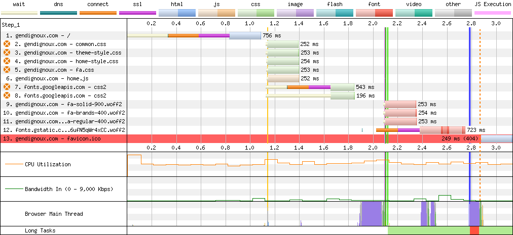
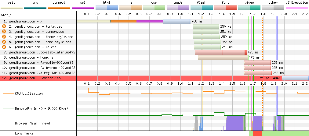
I’m quite happy about the result! It’s great to finally have a dark mode, without compromising on efficiency. Initial page loads need 4 to 10 times fewer bytes, with an initial rendering latency usually one third faster.
| Page | Downloaded size | First Contentful Paint | Largest Contentful Paint |
|---|---|---|---|
| Home (before) | 527 KB | 2.2s | 2.3s |
| Home (after) | 51 KB (-90%) | 1.7s (-22%) | 1.7s (-26%) |
| Last post (before) | 763 KB | 5.9s | 5.9s |
| Last post (after) | 182 KB (-76%) | 4.1s (-30%) | 4.1s (-30%) |
| Heavy images (before) | 1,121 KB | 7.2s | 7.2s |
| Heavy images (after) | 106 KB (-91%) | 4.5s (-38%) | 4.5s (-38%) |
The waterfall diagrams are how they should be: not too many lines, not extending too much on the right.
 Final downloads on my home page.
 Final downloads on my last blog post.
 Final downloads on an image-heavy blog post.
Bonus: a little CSS mystery
CSS is a terrible language. It’s totally fine in terms of selectors to assign arbitrary properties to elements, but it provides no feedback to tell if a combination of properties makes sense for the given elements. No compilation error, no warnings, just a broken layout… So it’s no wonder that I stumbled upon a little mystery.
This started when my previous blog post would render with a horizontal scroll bar on mobile (i.e. when the width is small), on Chrome and Safari but not on Firefox. This was annoying because users would unintendedly scroll with their fingers in all directions, and the navigation bar at the top of the page would not stay sticky. This behavior was weird because I made sure all the elements that could overflow (code, tables) have their own scroll bar, and I configured long words to break rather than overflow. And indeed, no content appeared to overflow on the right.
body {
    /* Words that exceed the width are broken and continue on another line. */
    overflow-wrap: break-word;
}
I eventually bisected the problem to a particular table (i.e. removing that table would remove the page’s horizontal scroll bar), which was even weirder because the table had its own scroll bar, thanks to the following rules.
table {
    display: inline-block;
    overflow-x: scroll;
}
I looked through a few StackOverflow answers, and after a lot of trial and error the following combination seemed to work.
html, body {
    overflow-x: hidden;
    height: 100%;
}
body {
    position: relative;
}
Additionally, I had to switch the scroll-padding-top property from the html to the body.
This property ensures that clicking on an anchor link will have the title (i.e. anchored element) appear just below the navigation bar, rather than hidden under it.
-html {
+body {
     scroll-padding-top: 65px;
 }
/* Relevant rules from the navigation bar. */
.navbar {
    position: sticky;
    top: 0;
    min-height: 50px;
}
The mystery is that I don’t understand why it works, nor why the table caused an overflow in the first place.
I don’t particularly care about having both an html and a body element, I only use the latter.
A very weird part is why setting some elements’ heights to 100% (isn’t that a default?) has any influence on horizontal scrolling.
Comments
To react to this blog post please check the Mastodon thread.
You may also like